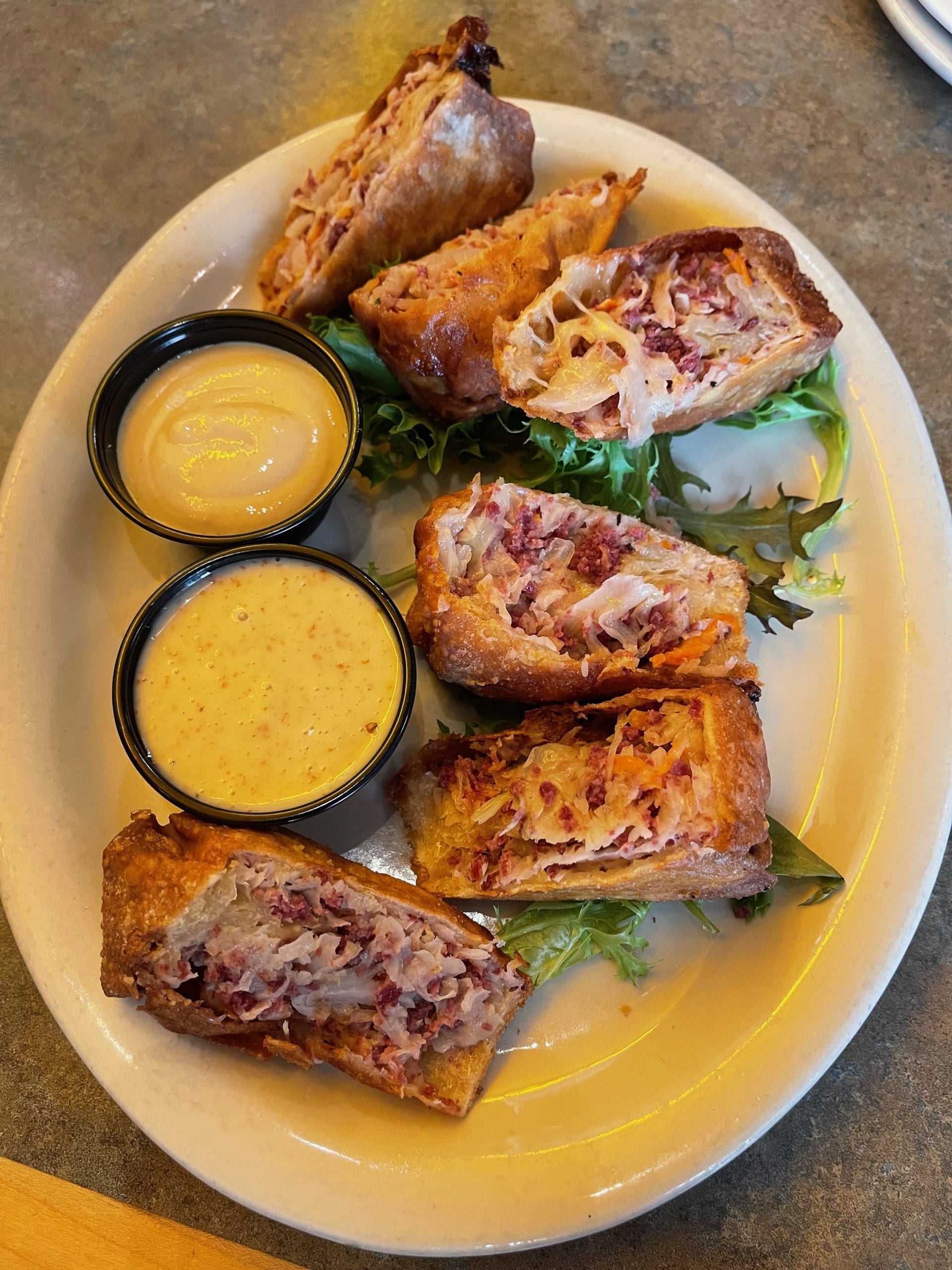
O’Niell’s Irish Pub – Albuquerque, New Mexico
Despite several efforts by the United States Department of Agriculture (USDA) to make it more user-friendly, the Food Pyramid has never been that easy to understand. Could confusion be one of the reasons 73.6% of American adults are either overweight or obese (according to the Centers for Disease Control)? Based on that alarming percentage, you’d think the pyramidal nutritional guide has chocolate as its base topped with pizza, burgers and cheesecake tapering to a whipped cream covered point. Perhaps to alleviate confusion, in June, 2011, the USDA replaced the ubiquitous food pyramid with a graphic depiction of a plate which…